
User interface (UI) – a term which many will understand, but also a term which gets sidelined by most people not in the tech world as ‘techy speak’. The actual definition is “the means by which the user and a computer system interact, in particular the use of input devices and software” but really what it means it HOW EASY IS THIS THING TO USE.
My experience of LegalTech products, especially in the real estate space, is that good UI (and UX, the experience of the user) is rare. And I just don’t understand it.
UI has taken great strides over the years across many different industries. One area which has excelled is computer games. They’ve nailed UI/UX so well that we even refer to ‘gamification’ in design, the way in which a product can be designed to hook their users in by clever UI/UX tricks.
Take Angry Birds, one of the most successful games of all time.
![Pin on [Game Art / UI] Angry Bird / Angry Bird Stella](https://i.pinimg.com/originals/c4/c9/78/c4c978481bc1656dc9e175f1a9d4d9e5.png)
Even the menu is clear. Each button clearly refers to what action it will unlock, and the big call to action in the middle of the screen calls it as it is = tap here to PLAY.
Let’s now take a typical CRM platform. This doesn’t look too dislike a number of ‘very successful’ LegalTech platforms I’ve had the pleasure of trying:
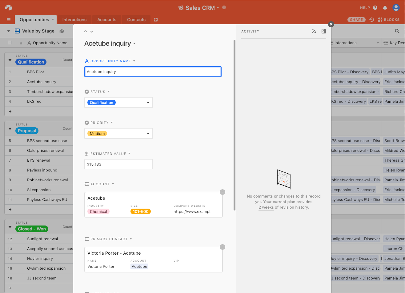
Umm. 🤔 Where do you even begin? How many buttons? How many boxes?
And what does this lead to? Unsurprisingly, an adoption problem for law firms looking to adopt technology. Lawyers don’t have the time to spend hours training themselves on a new, complicated platform. Lawyers don’t want to watch a ‘two hour webinar’ to ‘change the way they review contracts’. We have clients, and targets, and billable hours to hit – why on earth would we waste our time looking at this? Good, intuitive and SIMPLE UI is key to bringing legal technology to the masses. Remember, most lawyers barely feel comfortable in Word or Outlook, let alone something like the above.
But why does this happen? Well, the law is complicated. So any platform which tries to replicate legal analysis must be equally complicated right? We don’t think so. Avail has built its entire USP around simple interfaces, constantly dumbing down the number of buttons and screens to maximise adoption. The proof is in the pudding. STOP MAKING THINGS COMPLICATED.
Why should lawyers be any different to gamers? If gaming has nailed the psychology behind adoption through good UI and UX, why won’t this work for lawyers also? We can see that the majority of people who play mobile phone games are of adult age anyway so…draw your own conclusions 😄
So, what are the key takeaways for the industry?
- Stop making things complicated.
- Listen to lawyers about what they want, and then design something that fits in with their current workflow.
- Reduce buttons, reduce screens.
- Question every feature – if only 2% of your users use something, is it worth confusing the other 98% with it?
- Disruption is great, until it becomes interruption. Then lawyers won’t use your product.
- Put time and effort into your UI and UX. You won’t regret it.

Dom Conte
Head of Projects
Having run two high growth tech startups before practising as a senior real estate lawyer in the City for a number of years, Dom brings industry experience to his role heading up all artificial intelligence projects at Avail